BTO 4 room
Walnut Sanctum
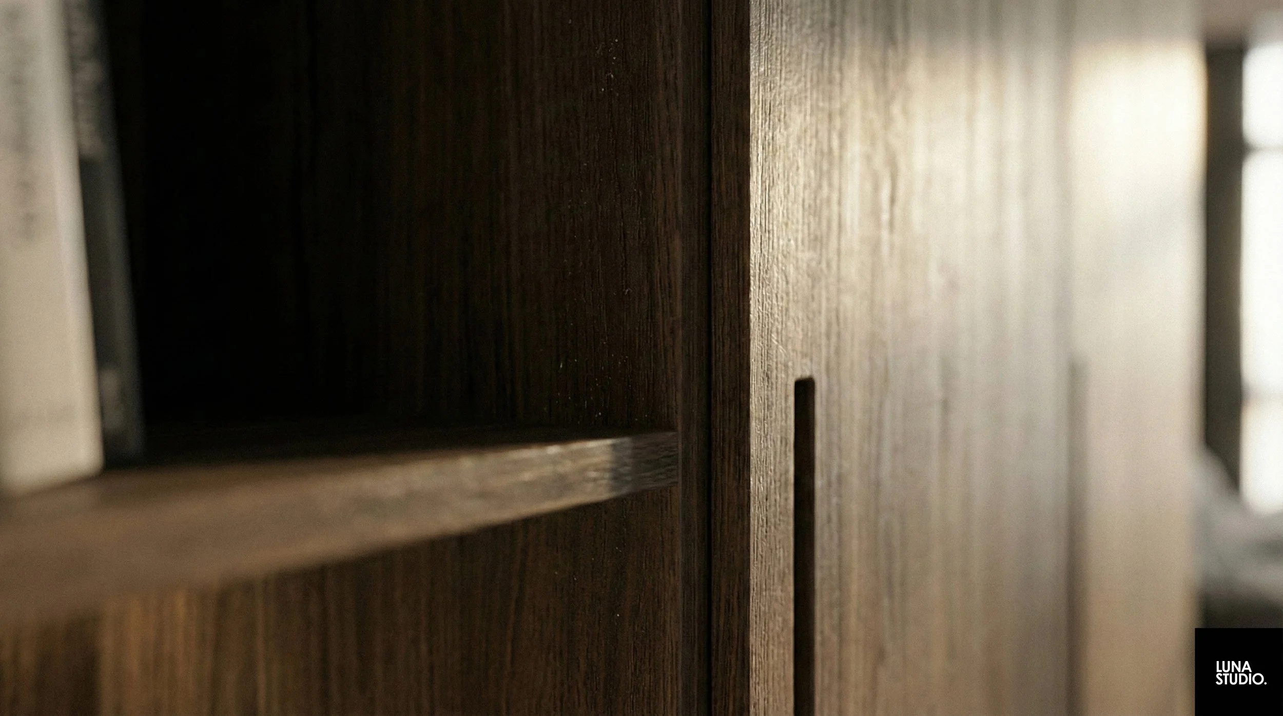
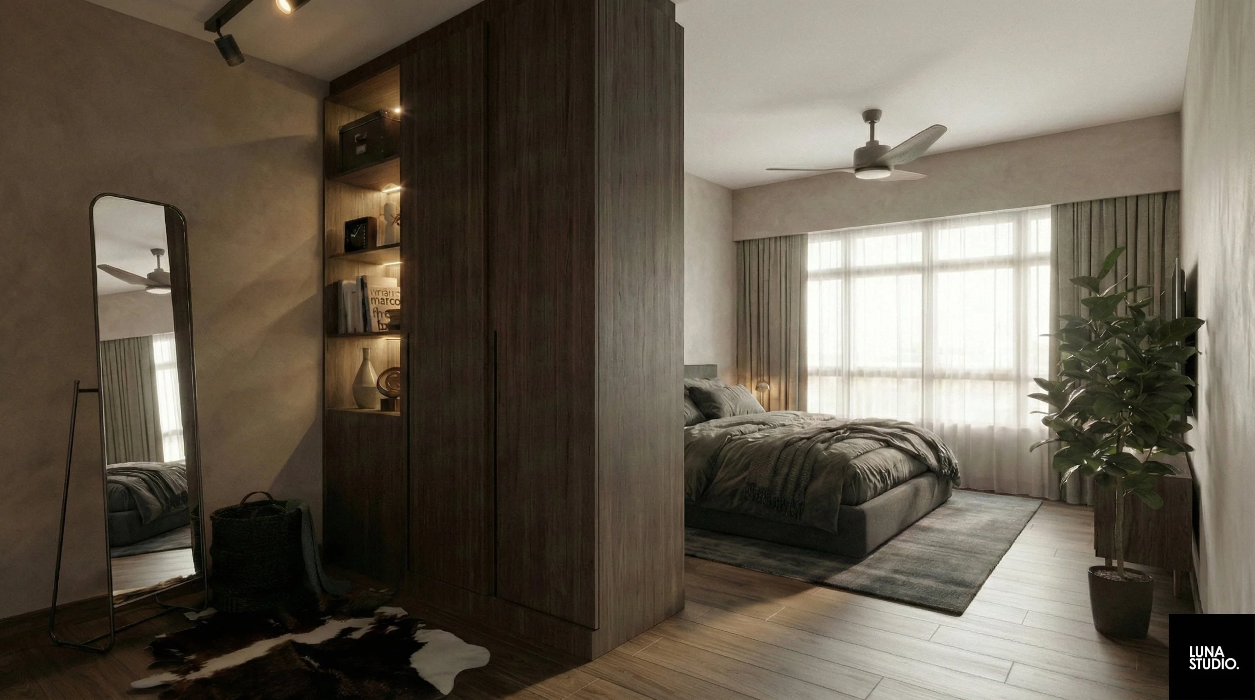
A Study in Contrast
I often tell homeowners not to be afraid of dark wood in small spaces. The secret is in the contrast. For this BTO, we used rich, deep walnut tones to anchor specific areas, while keeping the surrounding walls crisp and bright. This dynamic—dark wood against bright walls—creates a depth that actually tricks the eye into seeing more space, not less. It feels grounded, yet incredibly airy.
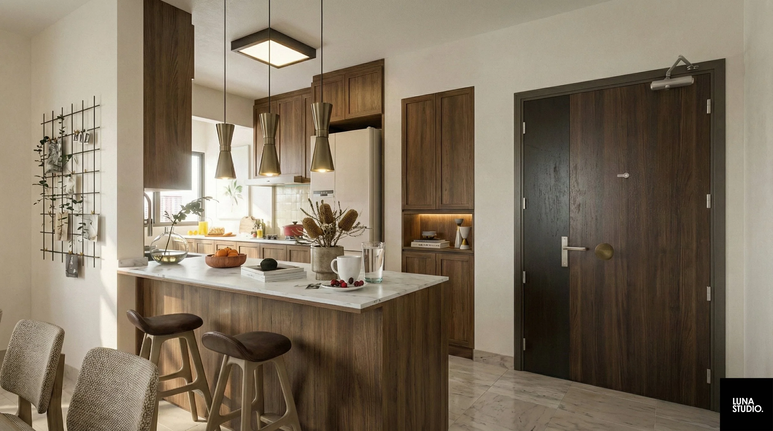

Bright Walls, Deep Grains
Picture walking into a home where the walls are a clean, bright canvas, and the joinery acts as art. We deliberately kept the vertical surfaces bright to reflect light, using the dark walnut only to guide the eye from the living to the dining zone. By blurring the boundaries with this consistent, rich timber against a backdrop of white, we reduced visual clutter. The result? A home that feels significantly wider and breathable, washed in natural light.
Interlude // Expanding Depth Through Texture
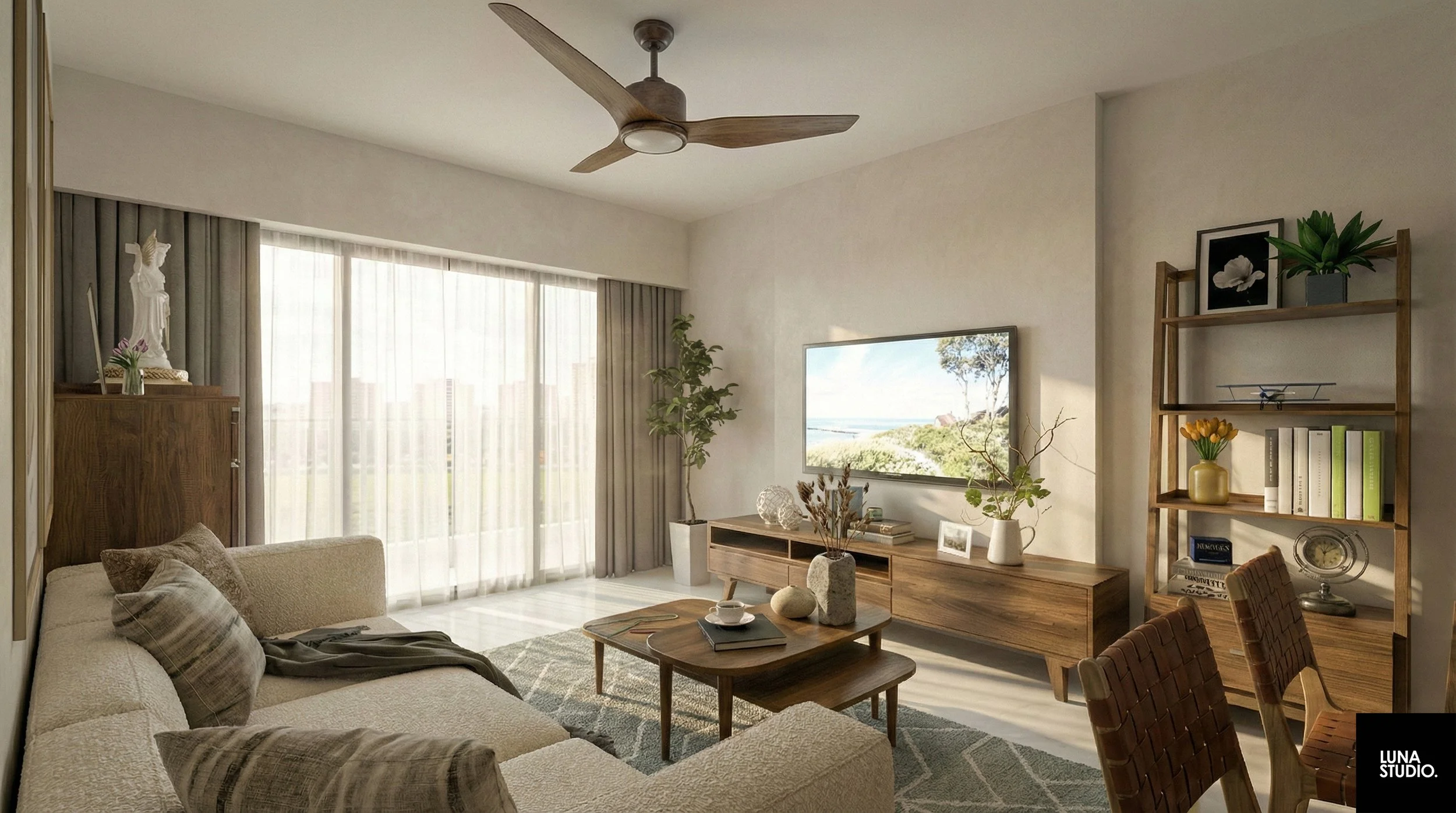
Boundless & Breathable Living
We treated the living area as a sanctuary of light. Instead of closing the space in with a heavy feature wall, we kept the walls bright and untouched. The drama here comes from the furniture—dark walnut pieces that sit elegantly against that clean, white backdrop. This approach maximizes the "negative space," pushing the visual boundaries outward. It feels less like a standard apartment and more like an unconfined, light-filled lounge where the dark wood serves as a luxurious accent.
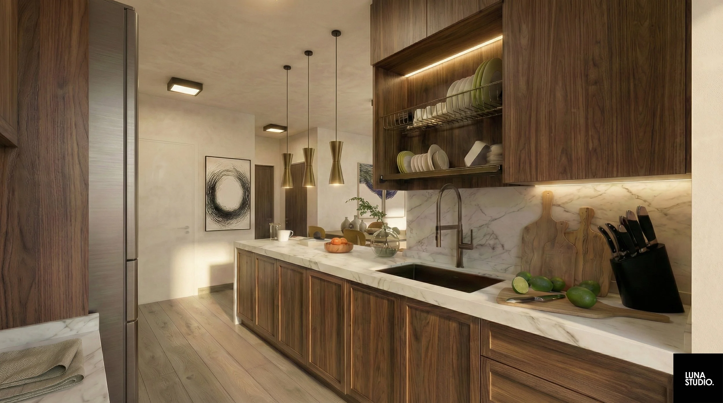
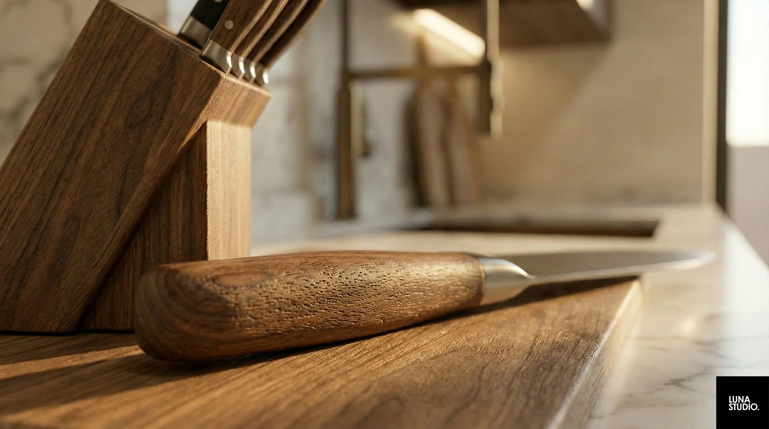
Luxury in the Grain
True luxury isn't about being flashy; it's about the quality of the materials. We moved away from sterile finishes and embraced the deep, tactile beauty of dark natural wood grains. Every handle and panel creates a stark, beautiful contrast against the bright room. This interaction between the light-flooded space and the dark walnut textures ensures the home feels expensive, warm, and sophisticated without ever feeling small.